In the example given[1] the fields look like they are disabled. I probably wouldn't even try to type into them, I'd just assume that something was broken.
I've seen tons of disabled input fields that look like this (e.g. showing you your un-changeable email address), so yeah - that would be my first instinct as well.
The colored background container is totally fine tho, those are everywhere and they help draw attention.
Normally I'm of the opinion that, if even just one or two people have the same problem with a UI, it's probably worth considering a valid, addressable problem, no matter how much it seems like the user's "fault", but even I'm having trouble rationalizing this one. May I suggest that maybe you're having this thought because, intellectually, you know how disabled fields are frequently styled, however, in natural conditions, you probably wouldn't actually make that assumption unless not all of the fields were styled that way?
I'm familiar with them, sure. But to assume something like this is broken rather than simply a color choice would, to me, be a strange and usually wrong assumption. Given that we've all (well, most of us) been on the web for 20-some years now, and noticed that web designers, for better or worse, often stray from defaults and choose different colors.
More often than they put a form field with all the fields disabled.
I'd certainly try typing into it before I emailed customer support.
Incidently, on that codepen, the background colors of the disabled and non-disabled elements are identical, to my eyes. The only difference is in the border color. (and the behavior when clicked on)
FWIW, on my uncustomized chrome, I'm seeing the same style as FF. If I recall correctly, these have been the default styles in every browser I've seen since Netscape Navigator. Not sure about Safari.
> Avoid using solid gray text fields because users tend to perceive them as disabled or inactive.
Any darker color than the background could be perceived as disabled as well. All the given examples with a box darker than the background looked disabled to me. The ones with a darker background and white text boxes looked fine though.
No. A filled-in background means the field is disabled. Why are people hell-bent on trying to fix something that works? Everyone knows how text boxes work already; they don't need to be improved. Same color as the background means editable, different color means disabled.
This really piqued my interest, and so I took a look closer into the examples used:
1. Website examples: Twitter.com, Etsy.com, and Spotify.com signup forms don't use any off-white.
2. The visual examples provided are apples to oranges. Removing an input field and adding more padding were the factors that made the 'right-side examples' more visually appealing
My first thought is this really needs an A/B test. Instead of just asserting that off-white fields are better than white fields, try it out on a real website and see if the conversion is improved.
I actually think the assertion that the color of your text fields is going to be the determining factor for potential users is not a sturdy one. A lot of the time, what users are looking for is the thing that solves their problem and it doesn’t really matter how it looks as long as it’s usable / understandable.
Also, while this design approach is probably more aesthetically pleasing to people like us, it might not be for someone like my grandpa who may get confused.
>it doesn’t really matter how it looks as long as it’s usable / understandable
What if how it looks makes it more usable or understandable? That's the case here with colored form fields, and if it makes the user's experience better you may be able to increase the rate of users filling out the form. At a glance the brain can intuit a form from the repetition of colored form fields whereas white on white takes more effort to understand visually. With a high volume site that depends on making spending money as quick and easy as possible, the marginal usability over white on white could be millions of dollars in marginal revenue.
Absolutely agree that at scale this matters in a big way, but I’d argue most of us are not working at FAANG.
Most of us are probably working on a side project or some extremely targeted piece of software for construction workers or crypto or AI for self driving cars where the scale is x thousands at best.
While we are on UX design of sign up forms: Please do not put widgets (like show/hide buttons) inside the form fields for passwords. Third party password managers often use this spot for their interface elements because they can't predict safe spots on random pages.
And now I miss Windows Phone 7 with its hyper-consisten and unforgiving design language. A white box was text. A blue box is a button. Black background is just display. Those are all the colors. You don't get to reinvent any wheels.
I don't understand how the word 'clinical' is being used in this context. Wiktionary gives a few meanings for the word, the only one that seems potentially related being "Cool and emotionless."
But that doesn't really make sense here. The colors being used don't seem like 'warm' colors to me, and I don't see how these shades are meant to be more emotional than white. If anything, I associate these beige sorts of colors with reserved corporate blandness, which I'd call cool and emotionally distant by design. It's the color of office equipment.
The colors used are absolutely warm colors, they are basically orangish. Warm vs. cool in colors is basically orange vs. blue.
I would describe the pure white forms as being rather harsh. They are harder to look at to me, because the text in the fields isn't differentiated from the text outside them.
I'm not claiming it is a major thing, it's like the difference between two fonts, some are more readable and attractive than others.
Plain, white, and minimal (in a strictly unadorned sense, as opposed to filled with hip furniture). Clean lines, no frills. 'Sterile' would be a similar description within the same metaphor even, if that helps.
If he just said, 'white is clinical' I'd get that. But 'white is clinical while beige isn't' leaves me confused. It's like saying 'strawberries are sweet but plums aren't.' After hearing something like that, it leaves you wondering if the term means the same thing to the other person.
Beige is a very common color in hospitals too. Hospital beds are very frequently beige, as well as various other equipment. If white is the most common color in hospitals, beige is surely a close second.
This may seem like mumbo-jumbo but colors have a psychological effect on people. Beige also conceals stains from body fluids better than white. In any case I was explaining the usage of "clinical" and not "hospital beds."
I don't dispute that colors can have psychological impacts on people; it's obvious that they can. What I dispute is beige being less 'clinical' than white, insofar as white can be clinical the term seems to fit beige just as well.
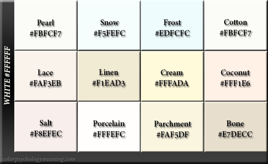
Also the page you linked gives 'shades of white' that include beige-like colors: https://colorpsychologymeaning.com/wp-content/uploads/2019/0... Which I think reinforces my point that these are very similar colors used in similar (clinical) contexts. White gives you notions of purity or cleanliness while beige is neutral and relaxed, either has obvious value in a clinical setting.
[1]: https://uxmovement.com/wp-content/uploads/2020/01/off-white-...